Last March, many involved in the residential housing industry feared the market would be crushed under the pressure of a once-in-a-lifetime pandemic. Instead, real estate had one of its best years ever. Home sales and prices were both up substantially over the year before. 2020 was so strong that many now fear the market’s exuberance mirrors that of the last housing boom and, as a result, we’re now headed for another crash.
However, there are many reasons this real estate market is nothing like 2008. Here are six visuals to show the dramatic differences.
1. Mortgage standards are nothing like they were back then.
During the housing bubble, it was difficult not to get a mortgage. Today, it’s tough to qualify. Recently, the Urban Institute released their latest Housing Credit Availability Index (HCAI) which “measures the percentage of owner-occupied home purchase loans that are likely to default—that is, go unpaid for more than 90 days past their due date. A lower HCAI indicates that lenders are unwilling to tolerate defaults and are imposing tighter lending standards, making it harder to get a loan. A higher HCAI indicates that lenders are willing to tolerate defaults and are taking more risks, making it easier to get a loan.”
The index shows that lenders were comfortable taking on high levels of risk during the housing boom of 2004-2006. It also reveals that today, the HCAI is under 5 percent, which is the lowest it’s been since the introduction of the index. The report explains:
“Significant space remains to safely expand the credit box. If the current default risk was doubled across all channels, risk would still be well within the pre-crisis standard of 12.5 percent from 2001 to 2003 for the whole mortgage market.”
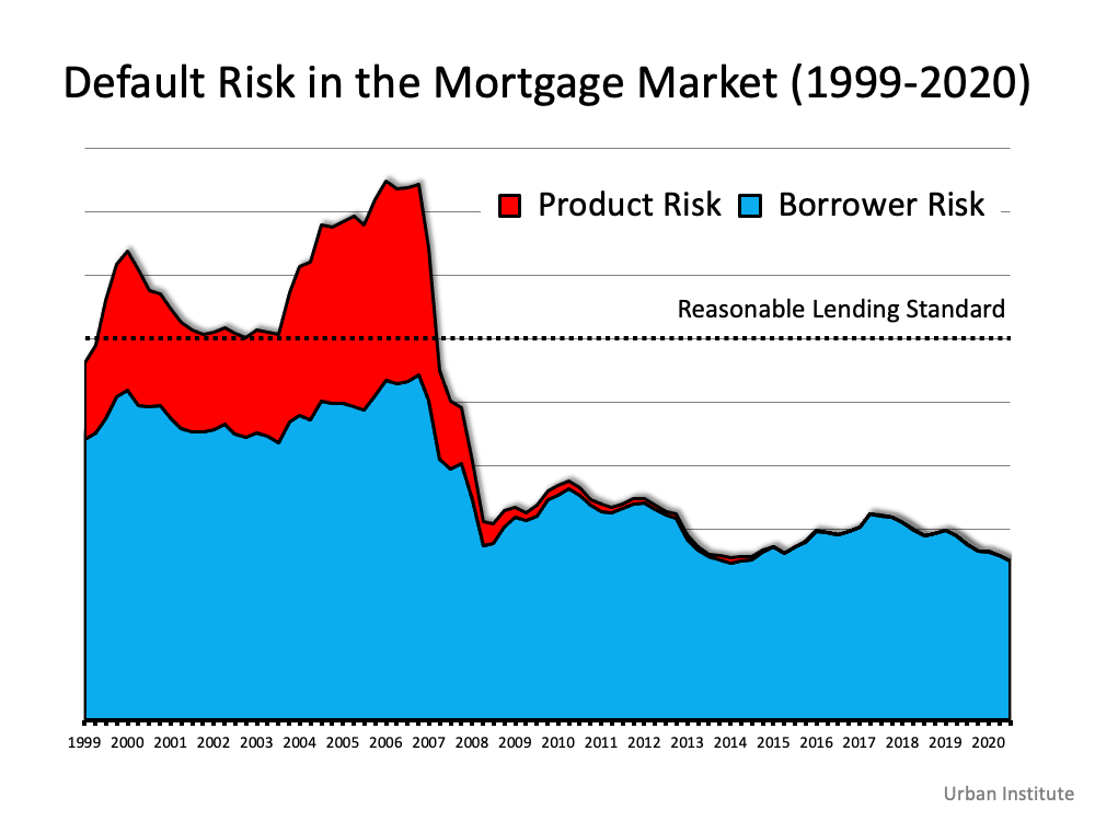 This is nothing like the last time.
2. Prices aren’t soaring out of control.
Below is a graph showing annual home price appreciation over the past four years compared to the four years leading up to the height of the housing bubble. Though price appreciation was quite strong last year, it’s nowhere near the rise in prices that preceded the crash. There’s a stark difference between these two periods of time. Normal appreciation is 3.8%. So, while current appreciation is higher than the historic norm, it’s certainly not accelerating out of control as it did in the early 2000s.
This is nothing like the last time.
3. We don’t have a surplus of homes on the market. We have a shortage.
The months’ supply of inventory needed to sustain a normal real estate market is approximately six months. Anything more than that is an overabundance and will causes prices to depreciate. Anything less than that is a shortage and will lead to continued appreciation. As the next graph shows, there were too many homes for sale in 2007, and that caused prices to tumble. Today, there’s a shortage of inventory, which is causing an acceleration in home values. This is nothing like the last time.
4. New construction isn’t making up the difference in inventory needed.
Some may think new construction is filling the void. However, if we compare today to right before the housing crash, we can see that an overabundance of newly built homes was a major challenge then, but isn’t now. This is nothing like the last time.
5. Houses aren’t becoming too expensive to buy.
The affordability formula has three components: the price of the home, the wages earned by the purchaser, and the mortgage rate available at the time. Fifteen years ago, prices were high, wages were low, and mortgage rates were over 6%. Today, prices are still high. Wages, however, have increased, and the mortgage rate is about 3%. That means the average homeowner pays less of their monthly income toward their mortgage payment than they did back then. Here’s a chart showing that difference: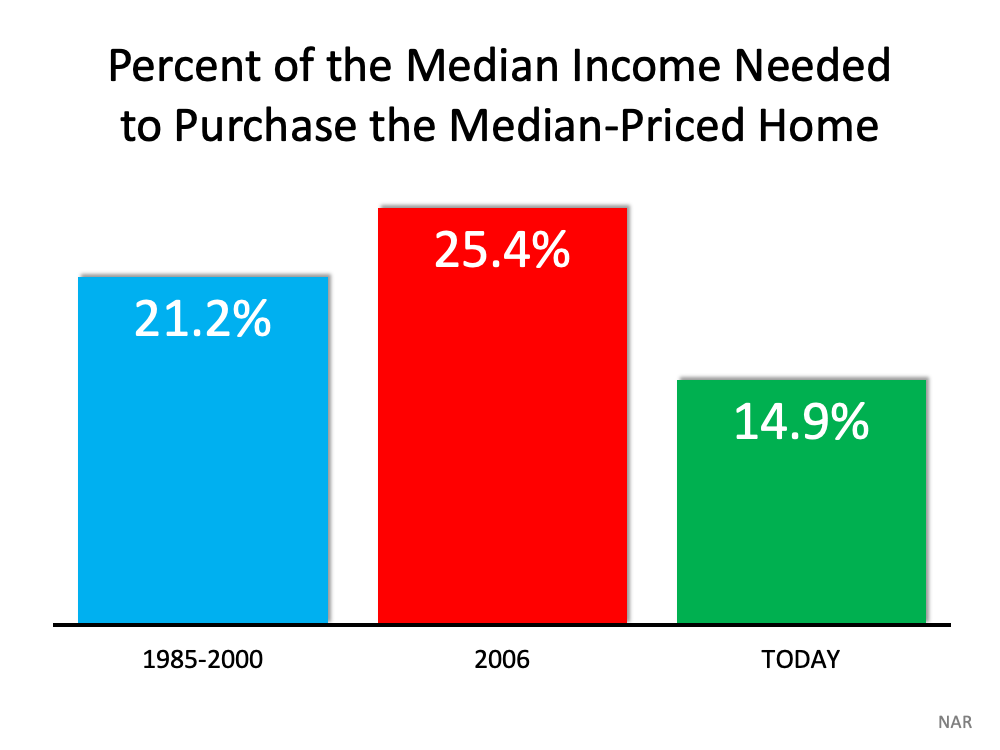 As Mark Fleming, Chief Economist for First American, explains:
“Lower mortgage interest rates and rising incomes correspond with higher house prices as home buyers can afford to borrow and buy more. If housing is appropriately valued, house-buying power should equal or outpace the median sale price of a home. Looking back at the bubble years, house prices exceeded house-buying power in 2006, but today house-buying power is nearly twice as high as the median sale price nationally.”
This is nothing like the last time.
6. People are equity rich, not tapped out.
In the run-up to the housing bubble, homeowners were using their homes as personal ATM machines. Many immediately withdrew their equity once it built up, and they learned their lesson in the process. Prices have risen nicely over the last few years, leading to over 50% of homes in the country having greater than 50% equity – and owners have not been tapping into it like the last time. Here’s a table comparing the equity withdrawal over the last three years compared to 2005, 2006, and 2007. Homeowners have cashed out almost $500 billion dollars less than before: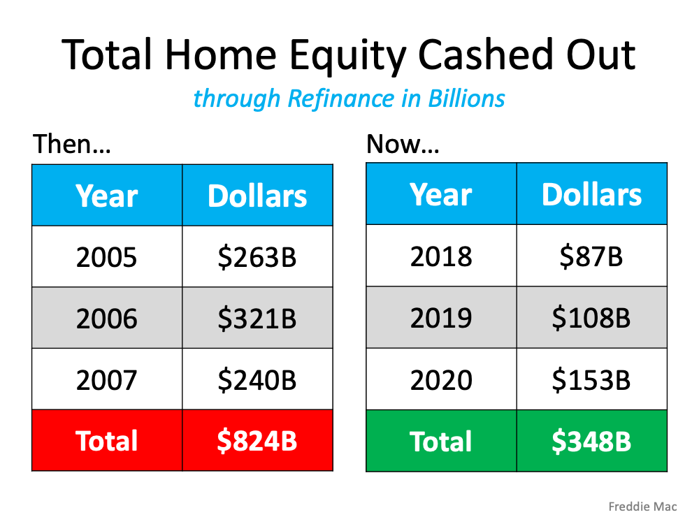 During the crash, home values began to fall, and sellers found themselves in a negative equity situation (where the amount of the mortgage they owed was greater than the value of their home). Some decided to walk away from their homes, and that led to a wave of distressed property listings (foreclosures and short sales), which sold at huge discounts, thus lowering the value of other homes in the area. With the average home equity now standing at over $190,000, this won’t happen today.
This is nothing like the last time.
Bottom Line
If you’re concerned that we’re making the same mistakes that led to the housing crash, take a look at the charts and graphs above to help alleviate your fears.
Source: KCM